

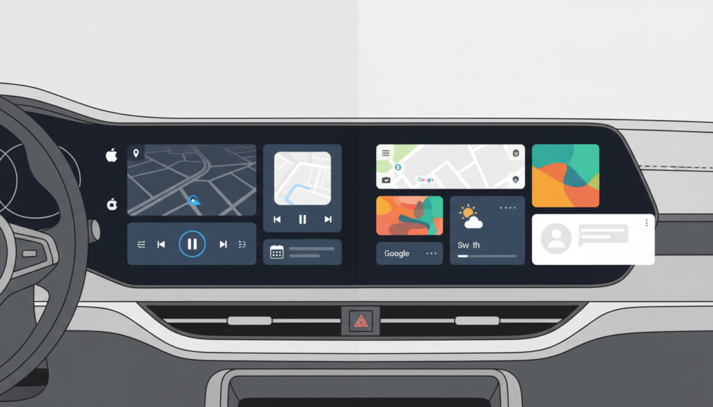
As Android Auto tests new homescreen widgets, we analyze how they compare to Apple CarPlay’s established interface. Explore the differences in customization, safety, and future infotainment trends in this detailed breakdown.
Modern drivers demand information at a glance. Consequently, the competition between dashboard interfaces has intensified. For years, Apple has maintained a lead with its sleek dashboard view. However, Google is now countering this with rumored updates. This analysis explores the evolving landscape of Android Auto vs Apple CarPlay widgets.
Widgets serve as bite-sized data containers. Functionally, they allow users to view maps, media, and calendar alerts simultaneously. Therefore, you do not need to switch apps constantly. This reduction in interaction improves safety. Furthermore, it enhances the overall driving experience. Both tech giants recognize this necessity. Yet, their execution differs significantly.
Apple CarPlay: The Established Standard
Apple introduced its dashboard view years ago. It remains a staple of Consumer Tech in vehicles. The interface splits the screen into logical sections. Typically, navigation takes the largest box. Subsequently, media controls and suggested destinations fill the remaining space.
The design is undeniably polished. Moreover, it is highly consistent across different vehicle manufacturers. However, this consistency comes at a cost. Users cannot resize these widgets freely. The layout is largely static. As a result, personalization options are limited. Apple prioritizes uniformity over granular control. For many, this simplicity is a benefit. Nevertheless, power users often request more flexibility.
Android Auto: The Beta Evolution
Google is taking a different approach. Recent reports from Android Authority suggest significant changes. Beta screenshots reveal a focus on modularity. Unlike Apple, Androud Auto
may soon allow users to resize widgets. This would enable a truly custom homescreen.
Currently, the “Coolwalk” update brought a split-screen view. However, upcoming widget features promise even more freedom. You might prioritize music over maps, for instance. Additionally, support for third-party widgets could expand. This aligns with the open nature of Mobile and App Ecosystems. Consequently, Android users may soon enjoy a dashboard that feels uniquely theirs.
Feature Comparison: Customization and UI
The battle of Android Auto vs Apple CarPlay widgets hinges on philosophy. Apple offers a walled garden. In contrast, Google pursues open customization.
- Customization: Android aims to let users resize and rearrange tiles. Apple keeps the grid fixed.
- Interactivity: Both platforms limit touch inputs. This restriction ensures driver safety. However, Android may allow deeper widget interactions while parked.
- Aesthetics: CarPlay uses rounded, uniform corners. Android adapts to the screen size of the car. Therefore, Android fits better on ultra-wide displays.
User feedback on Reddit highlights these differences. iPhone users appreciate the “it just works” factor. Conversely, Android enthusiasts eagerly await the ability to tinker with their layouts.
Design plays a critical role here. Experts in UX UI and Design argue that less is often more. Too much customization can clutter a dashboard. Consequently, this clutter becomes a distraction. Apple prevents this by locking the layout. Google, however, trusts the user to manage their space.
If Android widgets become too complex, safety could suffer. Therefore, Google must implement guardrails. The system should prevent cluttered layouts while the car is moving. Furthermore, text sizes must remain legible at a glance. Balancing these needs is the core challenge for the next generation of Android Auto vs Apple CarPlay widgets.
What the Future Holds
The dashboard war is far from over. Rumors suggest Apple’s next-generation CarPlay will take over the entire instrument cluster. This could redefine widgets entirely. SammyFans notes that Samsung and Google are also collaborating closely. Their goal is to make Android Auto seamless across all screens.
Ultimately, the consumer wins. We are moving away from static lists of apps. Instead, we are entering an era of intelligent, contextual dashboards. Whether you prefer Apple’s polish or Google’s freedom, the road ahead looks promising.













1 thought on “Android Auto vs Apple CarPlay Widgets: The Battle for Your Dashboard”
Pingback: Android Auto Rolls Out New Home Screen Widgets for a Smarter....